The Histogram Template
Bell curve
Scientific research
Understand the distribution of your data
Identify patterns!
Don't be scared of statistics
The Histogram Template includes the following components:
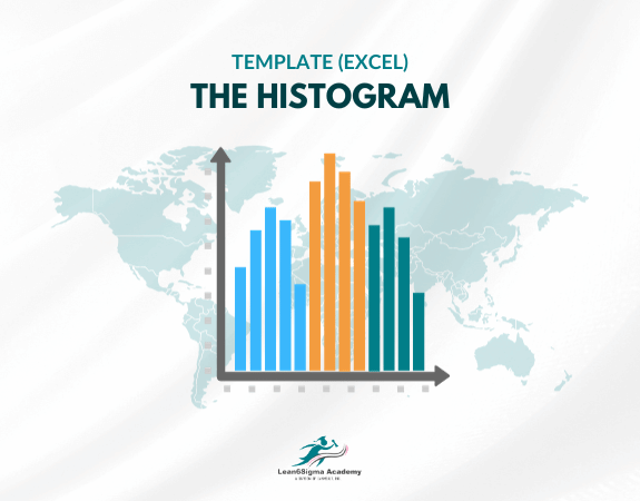
Data Intervals or Bins: The horizontal axis of the histogram represents the range of data values divided into intervals or bins. Each bin typically covers a specific range of values. The number and width of the bins can be adjusted to suit the data and analysis goals.
Frequency or Count: The vertical axis of the histogram represents the frequency or count of data points that fall within each bin. This axis shows how many data points belong to each interval.
Bars: Rectangular bars are used to represent the counts or frequencies in each bin. The height of each bar corresponds to the number of data points in the respective interval.
Title and Labels: The chart typically includes a title describing the dataset being plotted, labels for the X and Y axes, and any necessary additional information.
Histograms are valuable for various purposes, including:
Visualizing Data Distribution: Histograms help users understand the distribution of data, including whether it is skewed, symmetric, unimodal (having one peak), bimodal (having two peaks), or multi-modal.
Identifying Central Tendency: The location of the central tendency, such as the mean or median, is often visible as the highest point or peak of the histogram.
Assessing Data Spread: The spread or variability of the data is reflected in the width of the histogram and the distribution of data points within the bins.
Detecting Outliers: Data points that fall far from the main body of the histogram may indicate potential outliers or anomalies.
Comparing Datasets: Multiple histograms can be created and displayed together to compare the distributions of different datasets or variables.
This Histogram Templates is created using Microsoft Excel.
When constructing a histogram, it's important to select appropriate bin widths and intervals to effectively display the data's characteristics without oversimplifying or overcomplicating the representation.
Histograms are commonly used in data analysis, quality control, and scientific research to gain insights into the nature of data and make informed decisions.
0 Reviews
Riaan is a dynamic leader, coach, facilitator, Lean Six Sigma Master Black Belt with over 20 years of hands-on experience driving business results. Riaan is highly skilled and has worked across diverse industries internationally. With a degree in Chemical Engineering, Riaan started in the major breweries and bakeries in South Africa and was so dedicated to his work that he was often known to take his work home with him.